
12 signs of good content design
Contents
You don’t know it’s there – it just happens
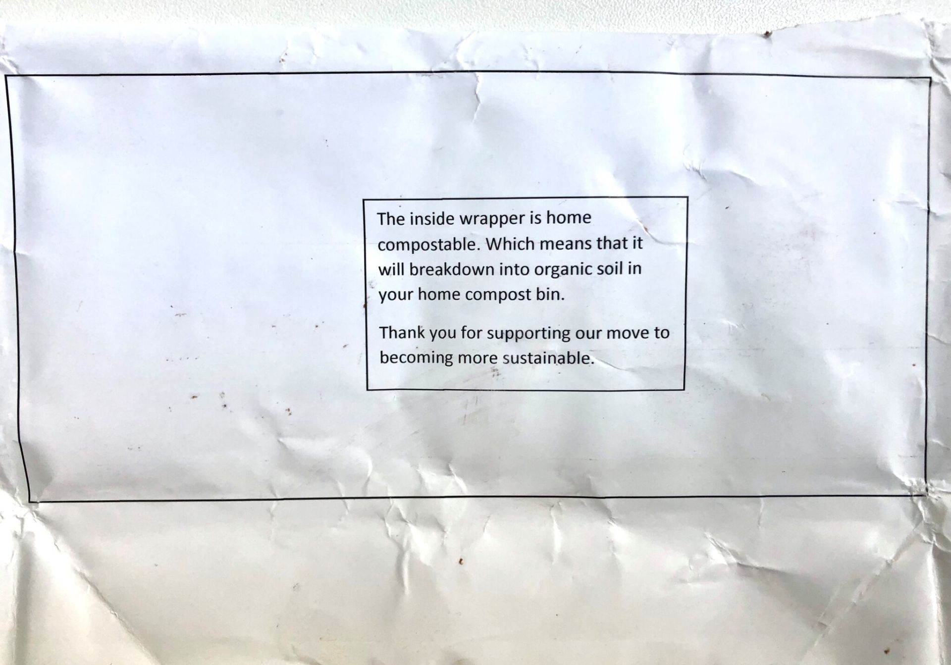
Clear microcopy in action
Example of microcopy
“A user interface is like a joke. If you have to explain it, it’s not that good.”
— Martin LeBlanc.
You don’t have to read something twice
Easy read in action
Example of an easy read
“Questions about whether design is necessary or affordable are quite beside the point: design is inevitable. The alternative to good design is bad design, not no design at all.”
― Douglas Martin.
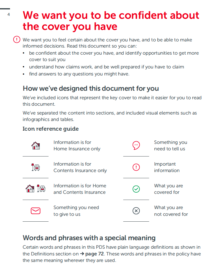
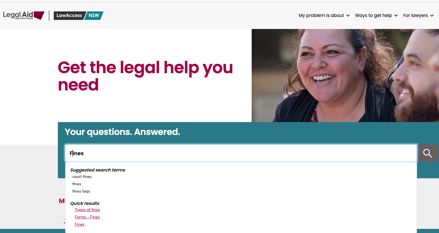
You could find it
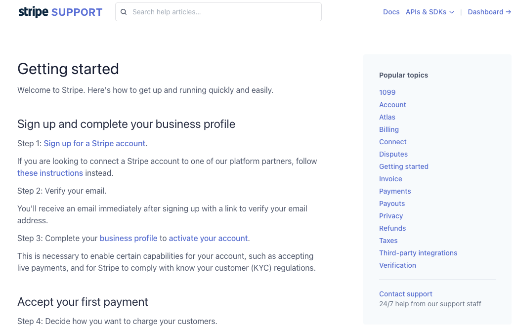
Findability in action
Example of search options
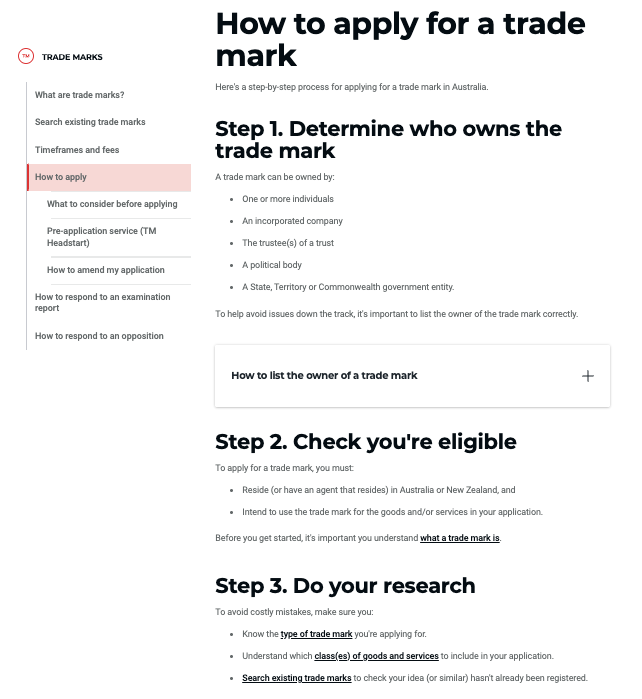
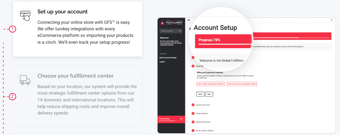
The process was seamless
Clear steps in action
Example of a clear process
You can complete a task without friction
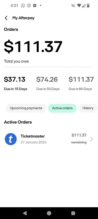
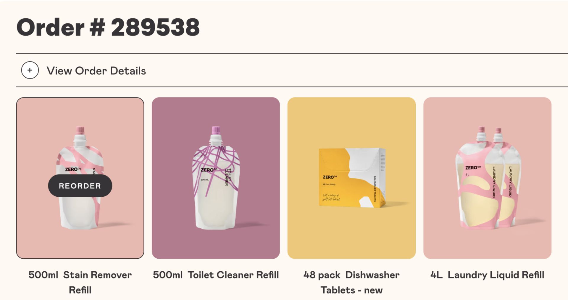
Fast tracked experience in action
Example of supporting fast decisions
You didn’t have to second-guess yourself
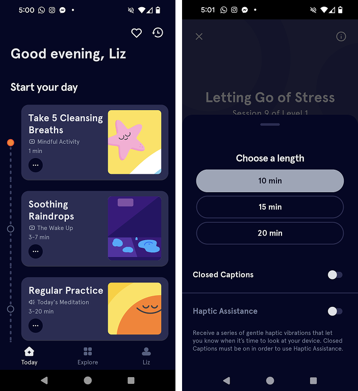
The right content at the right time
Example of simple instructions
You didn’t have to contact support
Clear support content in action
Example of findable support information
“If we want users to like our software, we should design it to behave like a likable person: respectful, generous, and helpful.”
― Alan Cooper.
You were left with the feeling of ‘that was easy’
Accessible and limited content in action - no fluff!
Example of giving users a choice
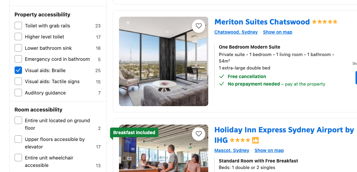
You felt included, not left out
Accessible information is available
Example of accessibility options
“When UX doesn’t consider ALL users, shouldn’t it be known as “SOME User Experience” or… SUX?”
― Billy Gregory.
It was the right amount of information, in the right format
Text and images working together in harmony
Example of clear text and images
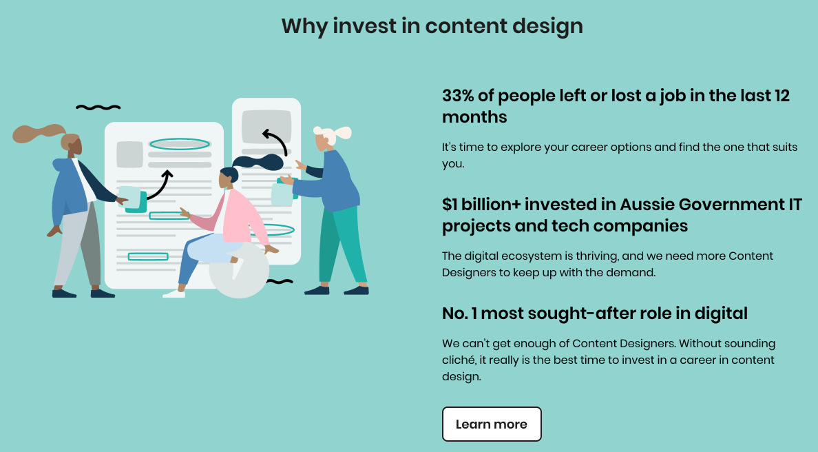
The content was valuable
Informative content in action
Example of highlighting important information

Become a content designer


Created with