How to create accessible content: a guide for inclusive design
Page last updated: 6 May 2025
Contents
The meaning of accessible content
Accessible content is content that everyone can use and understand, including people with disabilities. It means creating materials that are easy to read, navigate and interact with. These materials should be compatible for everyone and all devices and technology, including screen readers, keyboards and mobile phones.
As content designers, you can make your content inclusive by:
-
using simple language (words with 2 or less syllables)
-
using common and everyday words that your users understand
-
explaining complex words, phrases or topics – this includes legal and technical information
-
spelling out acronyms and initialisms
-
adding text descriptions to informative images
-
giving your content hierarchy from the most to the least important information
-
ensuring your content is visible and obvious to everyone – for example, not placing vital information in an accordion or in the middle of dense text
-
tracking the readability of your content to ensure it meets the standard reading levels of a 12-year-old.
“Accessible content isn’t just a nice-to-have—it’s a way to ensure everyone has equal access to information and services.”
Content Design Hub.
Why accessible content is important
Disabilities can happen to anyone—whether from birth, illness, an accident or the process of aging. They can also be temporary, like recovering from an injury.
Global disability statistics
People with disabilities are frequently the most affected by natural hazards, climate-induced disasters and global health emergencies.
16% of the global population, experience significant disability.
82% of people who use screen readers reported encountering barriers on websites. Most of the issues are content issues: no alt text, complex content and too much information.
User stories you should write for
We’ve crafted some user stories that may help you better understand specific user needs. Take these user stories to help generate your own templates.
Based on your audience and research, you can get refine them further and create a bank of stories that you plug and play. These stories connect you to the human side of content, rather than just writing for the broader ‘customer’.
People with chronic conditions

Scenario for a chronic condition
Alex is a 35-year-old living with rheumatoid arthritis. She experiences frequent pain and stiffness in her hands, making it difficult to use a standard mouse and keyboard.
She relies on voice recognition software to navigate websites and complete tasks online. However, she often encounters websites that are not optimised for voice commands, causing frustration and limiting her ability to access information and services.
User story for a chronic condition
As a user with a chronic condition that prevents me from using a mouse and keyboard,
I need to access websites that are optimised for digital commands.
I need to access websites that are optimised for digital commands.
This includes:
-
the ability to navigate headings and links in a structured and logical way
-
accessing buttons and form fields through voice command, rather than mouse clicks
-
searching for information using everyday language that’s natural to me, rather than technical speak.
So that I can access digital information and services without feeling frustrated and limited.
Older adults

Scenario for an older adult
Jordan is a 72-year-old retiree who enjoys staying connected with family through social media and video calls. However, Jordan has age-related macular degeneration, which affects his vision. He struggles with websites that have small text, low contrast and complex navigation.
Jordan appreciates websites that offer adjustable text sizes, high-contrast modes and intuitive layouts that make it easier to stay engaged online.
User story for an older adult
As a 72-year-old with macular degeneration,
I want to access digital content with adjustable text sizes, high-contrast modes and intuitive layouts.
This includes:
-
a way to zoom and maximise webpages on my mobile
-
the ability to read text in a low contrast mode
-
accessing menu options that use language I understand
-
websites offering consistent menu options so I can remember where to go and what to select.
So that I can stay connected with family and friends on social media and video calls.
People learning English

Scenario for a person learning English
Sam recently moved to Australia and is learning English as a second language. Sam often uses online resources to improve language skills and stay informed.
However, Sam finds it challenging to understand websites with complex language, idiomatic expressions and a lack of translation options. Sam benefits greatly from websites that provide clear, simple language, multilingual support and visual aids to help comprehend the content better.
User story for a person learning English
As a non-native English speaker,
I want to access websites that I can easily understand.
This includes:
-
icons, images and illustrations that support more complex topics
-
the use of simple content: short words and sentences
-
clear content with headings and lists, rather than dense text
-
translation support in my language.
So that I can make informed decisions without asking for help.
People with low literacy skills

Scenario for a person with low literacy skills
Taylor is a 40-year-old with low literacy skills. She finds it difficult to read and understand lengthy text on websites.
Taylor relies on websites that are simple and use visual aids to convey information. She also appreciates websites that offer audio versions of the content, allowing her to listen instead of reading.
User story for a person with low literacy skills
As a person with low literacy levels,
I want to access simple digital content in audio and visual formats.
This includes:
-
short videos
-
audio version of text
-
infographics, icons and illustrations that visually explain concepts
-
content with an easy read option (a reading level of a 10-year-old)
-
information that avoids questions
-
content that informs and explains with clear steps or lists.
So that I can easily digest information and make independent decisions.
There’s no one size that fits all
Disability is complex, nuanced, intersectional and diverse. The same disability can present and impact people in many ways. For instance, 7% of Americans have ambulatory disabilities, which means they may use a wheelchair for longer distances but can walk short distances.
When writing content, it’s important to consider the diverse needs of people. Accessible communication ensures everyone, regardless of their situation, can access information and services.
“Readable content is not just a legal requirement—it’s about upholding human rights, empowering people to give informed consent and fostering inclusivity for all.”
Content Design Hub.
Legal accessibility standards
In Australia, legal accessibility standards ensure that people with disabilities can access information, services and opportunities.
Key Australian standards and laws include:
Disability Discrimination Act 1992 (DDA): a federal law that prohibits discrimination based on disability. It mandates equal access to goods, services and facilities, including digital platforms.
Australian Human Rights Commission Guidelines: guidelines that interpret the DDA. They provide advice on ensuring accessibility in digital and physical environments.
The Digital Service Standard (the Standard): establishes the requirements for designing and delivering digital government services. It puts people and business at the centre of government digital service delivery.
Global standards include:
-
Web Content Accessibility Guidelines (WCAG): under the DDA, organisations are expected to comply with WCAG. Aim for Level AAA, the highest level of accessibility.
-
Public Law 111 - 274 - Plain Writing Act of 2010: an act to enhance citizen access to government information and services. Establishes that Government documents issued to the public must be written clearly.
-
Plain Language Act 2022: aims to improve the accessibility of certain documents that are available to the public.
-
Public Sector Bodies (Websites and Mobile Applications) (No. 2) Accessibility Regulations 2018: ensures services are accessible to everyone who needs it.
Non-compliance with local and global standards can result in legal complaints and reputational harm. These standards make accessibility both a legal obligation and a social responsibility.
Cognitive load theory
Creating accessible content is not just important for people with disabilities, but also for everyone’s daily cognitive load.
Every second, we receive 11 million pieces of information. However, out of those 11 million pieces, we can only consciously process 40. Yes, that’s 40/11, 000,000.
Our brain fills in the gaps. When we say to our clients, stakeholders and colleagues that we don’t want to overload the user with unnecessary information, it’s because we want to work with the cognitive load, not against it.
Cognitive load theory helps us to understand how much information we can interpret (or decode). The amount of information we can interpret can fluctuate from second to second.
Things that can reduce our capacity to take on information include:
-
distractions
-
attempting to multi-task
-
trauma
-
energy levels
-
time of day
-
exercise
-
sleep
-
food and drink intake
-
medical and developmental disorders
-
learning disabilities.
The list could fill a book.
Cognitive load theory gives content designers clear constraints to work within. These constraints can be the very fuel we need to get creative and make informed content decisions.
“Give me the freedom of a tight brief."
David Ogilvy, advertising genius.
How to write content that reduces a person’s cognitive load
Give users contextual information
Present users with information only when they need it. For example, don’t give them a full list of instructions at the beginning of a form. Instead, drip feed information when the user is performing the related task.
Consider
On an introductory form page: telling users that they’ll need to provide proof of identity documentation to complete their application.
Avoid
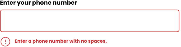
On an introductory form page: telling users how to upload identity documentation. Instead, add these specific details when they're completing the upload portion of the task.
Use readability tools to write in a clear way
Explore using a readability tool like ProWritingAid (expensive) or the Hemmingway Editor (free) to write concisely. Ensure every word adds meaning and reduce filler content (unnecessary words).
Write in this way even for internal documentation and communications. Employees can have reduced cognitive load just like customers.
Consider
We need to review our current process because of the new policy.
Avoid
The implementation of the new policy will necessitate a comprehensive review of current procedures.
Use a table of contents for long form content
Users might not need all the information you present. To help them skip, skim and navigate, use keywords in headings and add a table of contents.
Consider
Using headings like ‘About x’ and ‘Key points on x’ to organise the content. Link all H2s (heading 2) to a content's section, so users can select and navigate straight to the content they need.
Avoid
Writing paragraphs that discuss multiple topics and have more than 4 paragraphs. Instead, chunk up content into smaller subheadings from H2 to H6.
Use active voice
Help users make quick choices by using confident and assertive language. It reduces the complexity of too much information and too many options.
Consider
Call to action: complete the form.
Avoid
Call to action: if you’re thinking of applying, you can consider completing the form.
How to write accessible content
There are formulas, frameworks, tools and techniques that you can use to write accessible content. These are backed by science and move the digital writing process from being subjective and opinionated to objective and data-informed.
Use simple words and short sentences
Select words with 2 syllables max (where possible). Write sentences with no more than 20 words.
Polysyllabic words are words with 3 syllables or more. They are complex words because they take people longer to decode and understand. Why you should avoid using polysyllabic words:
Polysyllabic words are words with 3 syllables or more. They are complex words because they take people longer to decode and understand. Why you should avoid using polysyllabic words:
-
people with dyslexia and other learning disabilities have difficulty understanding them
-
people with low literacy may find it difficult to read and understand them
-
they make the meaning of your content more difficult to understand
-
people are time poor, and these words take more time to digest
-
it's faster for users to scan through pages when reading if the words are simple and clear.
Use words like this
Get
Avoid words like this
Ascertain
Write for the reading age of a 12-year-old
When we write for the reading abilities of a 12-year-old, our content reaches 80% of people.
Most people can:
-
understand short sentences (20 words)
-
read the equivalent of a Harry Potter book (another reason why it was so widely read)
-
understand only 8% of the Oxford English Dictionary.
In 2020, 68% of callers to the Reading Writing Hotline were from English-speaking backgrounds and went through school in Australia. Fluency in the English language does not correlate with literacy levels. When using simple language, we better connect with non-English AND native English speakers.
Write like this
Avoid using verbose content.
Do not write like this
Refrain from incorporating content characterised by excessive verbosity and superfluous elaboration.
Use the Australian Style Manual to add readability rationale to your style guide.
Write meaningful and user-centred content
Consider how often a word or phrase is used in everyday language. For example, would you tell someone to ‘alight on the couch’ or ‘sit on the couch’.
Uncommon words can:
-
create barriers
-
mislead
-
sound obnoxious.
Use common words to resonate with your users. You can find these words by conducting keyword search, user research and the pub test (talk to your friends to get their opinion).
Write like this
Get off the train.
Do not write like this
Alight from the train.
Create content patterns
Consistent content creates a familiar structure that helps users easily navigate and process information.
Content patterns allow users to retrieve data from their working memory. This leads to users quickly grasping key concepts and making connections between related ideas.
Consider
Starting all error messages with a verb. Provide the solution and take the blame.
Avoid
Using inconsistent styling for error messages. Being vague and blaming the user.
Example of good practice
Example of bad practice
Give structure and rhythm to your content
Label each subheading clearly. Ensure subheadings are tagged and nested correctly so a screen reader can announce content in the right order.
Place content in a logical order that is structured from the most important piece of information to the least.
Structure content like this
<h1>How to register your business
<p>You can register your business by filling out the application form.
<a>Application form
<h3>Call us
Do not structure content like this
<a>Application form
<h3>Call us
<p>You can register your business by filling out the application form
<h1>How to register your business>
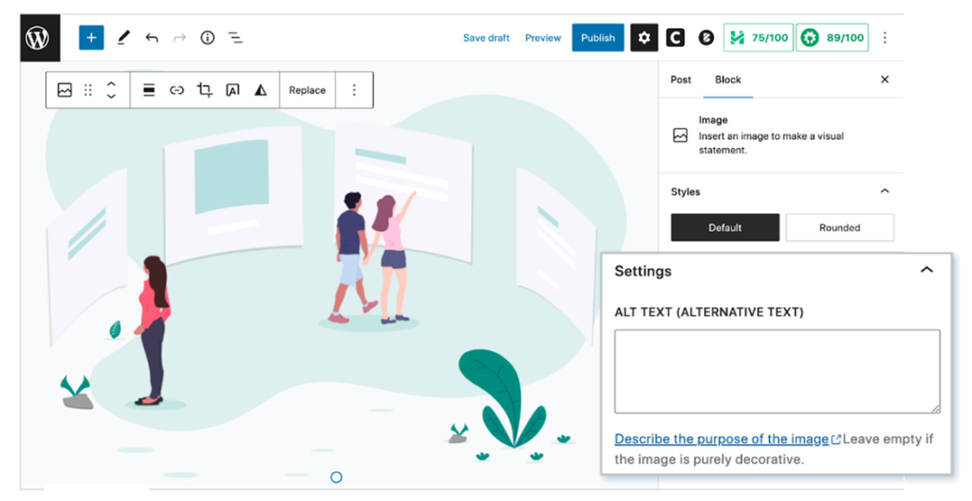
Use text alternatives for images
Identify images as decorative or meaningful.
Decorative images
A decorative image only enhances the visual appeal of content. It does not add any meaning to the user. When you mark images as decorative, they are not read out by screen readers.
How to treat decorative images
Select 'Mark as decorative'. Ensure the source code reads as: alt="".
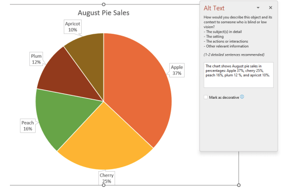
Meaningful images
A meaningful image gives users important information that’s necessary to the user’s understanding of content. This information is only available in the image and not within the text on the page.
How to write meaningful alt text
Describe the essential content and function of an image in a clear and concise way. Avoid unnecessary details. Ensure the alt text conveys the image's purpose, especially for users relying on screen readers.

How to write alt text for art pieces
Aim for a description that conveys the essential elements, context and emotions of the artwork. Keep language simple and concise. Aim for a balance between thoroughness and brevity.
Write like this
A scenic view of rolling hills beneath a vibrant sunset sky.
Do not write like this
The landscape is a peaceful expanse of rolling hills, their soft, green curves flowing gently across the land. Above, the sky is ablaze with vibrant colours as the setting sun casts hues of orange, pink, and purple, gradually merging into the cool tones of twilight. The sun’s fading light creates long serene shadows across the hills, enveloping the scene in a sense of calm and timeless beauty.
Use accessible and inclusive language
Not all people have the same experience when accessing digital content. It’s important to use words that are respectful and inclusive.
Writing in an inclusive way means that we can meet a diverse range of user needs. It considers all types of user experiences from swiping content on a mobile phone to listening to a virtual assistant tell you the time. It understands that some people may have colour blindness while some might use dark mode.
Ways to write inclusively:
-
Use culturally appropriate and respectful language when writing with, for or about First Nations people.
-
Respect people's preferences around personal titles, job titles and pronoun choice.
-
Engage people with disabilities in your research.
-
Write person-first language (unless user research says otherwise). For example, 'Person with cognitive disability'.
-
Refer to age only if it is necessary.
-
Use device-agnostic language. Instead of 'click', use 'select'.
-
Avoid using colour cues like 'select the red button'.
-
Avoid using directional language like 'see below' or 'go to the top right-hand corner'.
Provide captions and transcripts for videos
Adding captions and transcripts to videos ensures that individuals with hearing impairments can fully access the content. It also improves comprehension for viewers in noisy environments or those who speak different languages, making the video more inclusive and accessible to a broader audience.
Consider
Ensuring video captions can be easily turned on and off.
Avoid
Adding video captions that overlap text or other important visuals elements within a video.
Design descriptive and intuitive links
Write links that clearly and concisely convey the content or purpose of the linked page. Each linked text must be unique and use the same words that appear in the linked page.
Avoid using generic terms like ‘click here’ or ‘read more’. This helps both users and search engines understand the context and relevance of the link. It improves accessibility and SEO.
When using a screen reader, some users can ask for all links to be read out on a page. If each link text is the same (‘click here’, ‘click here’, ‘click here’), a user has no context and cannot make an informed decision on what to action. This is why descriptive links are important.
Write like this
To upskill in content design, go to 1:1 coaching – Content Design Hub.
Do not write like this
For coaching services, click here.
Example
Embedding readability into your content processes
There are 4 key things you can do to ensure readability is understood and implemented.
1
Use supplemental content like key summaries, definitions and easy reads to explain technical subject matter.
2
In your style guide or design system, reference AAA Web Content Accessibility Guidelines: Reading Level.
3
Add readability scores to your definition of done, so product teams are also required to be accountable for this.
4
Test and measure the readability of your content with a readability tool.
Accessible Content Checklist
The Accessible Content Checklist ensures everyone is creating legally compliant content. Anyone from content authors to Quality Assurers can use this checklist.
How to use this checklist:
-
Review it as a team before the writing process. This ensures everyone will make accessible content decisions from the start.
-
Add it to your content crits and review processes to sense-check draft content.
-
Send it to your stakeholders to educate and inform on content accessibility standards.
-
Embed it into your definition of done as the final check before go-live.

Author bio
Liz Leigh is the Co-Founder of Content Design Hub. She advocates for all things content design, helping individuals and companies to create accessible content.
Content courses and training
At Content Design Hub, we give you the skills and strategy to learn, grow and invest in content. In return, you’ll create inclusive digital worlds that speak the language of your users.
Upskill with us through:
Courses
Take the course, Writing for Accessibility.
Coaching
Get 1:1 or team training through coaching.

Content Design Hub is a marketplace for individuals and companies to learn, upskill and invest in specialised content skills.
We're grateful to the Traditional Owners of the lands throughout Australia on which we live, learn and work. We pay our respects to their Elders, past, present and emerging.
Social media
Copyright © Content Design Hub 2026. All rights reserved.
Created with